Introduction
Since the majority of this course relies on the outputs coming from the ArcGIS Pro program, the following assignment acts as an exploratory review of a function in ArcGIS Pro,the living atlas. The living atlas is an expansive growing network of information that can be brought into a project to build the data that you might be working with. Building data with preexisting information helps to highlight what you have done. I will start by talking about five lessons that I find interesting, hyperlink them,describe them, and finally relate them to my interests and background. Then there will be a section that goes through a pre-made lesson from ESRI titled Get Started with ArcGIS Living Atlas of the World. Finally, layers not in this pre-made lesson will be added and talked about. With a data base of helpful resources, the ArcGIS Living Atlas will provide a wealth of resources
Exploratory
Once in on the learn.arcgis.com page, the "Explore All Lessons" button was opened. This brought forth the entire lessons gallery. A filter was added for only the ArcGIS Pro product since it is the application we are working with.
The first lesson that looked interesting is the
Estimate Solar Power Potential. The lesson is about finding how much solar energy each roof top receives through a years period. It them goes on to having you determine the total amount of electricity that can be harvest from each rooftop array. I would like to explore this lesson because I grew up in an area that received a lot of sunlight year round. People in my neighborhood and even around the city would talk about putting up solar panels on their roofs.
The next lesson that caught my attention was
Assess Access to Public Transit. This lesson takes place in Chattanooga, Tennessee and ocuses on their buss routes. You use demographic data and existing buss stop routes to identify areas that are in need of access to public transport. Providing access to public transport helps to connect people and can boost town, city and state economies. Being able to relate this data could show interesting outputs.
Collect 3D Features from a Stereo Map focuses on the Los Angeles, California area. You review stereo imagery and pull 3D rooftop point features from it. In this scenario the data is used to track city expansion. This is interesting to see how data without a z value can still be used to determine height of buildings.
Extract Roof Forms for Municipal Development is set in Portland, Oregon. You use point cloud data set to develop a digital elevation model (DEM). You will then add roof form data to the building footprints to assess the roof attributes of eaves, gables, and slope. I take interest in this because the lidar data is super common and being able to process the point cloud from something like this is super important.
Finally,
Importing and incorporating 3D models in a scene is very interesting to me. The title speaks for its self. This lesson takes you though the process of importing models and helps talk you thought making adjustments to the geographic locations. I use Fussion 360 and AutoCAD extensively. Being able to bring my models back to their location of origin would be very cool.
Obviously there is a lot of divers material in the living atlas that can bring a lot to a map. These lessons help build knowledge base and guide the users through an exploration of the program.
Methodology ESRI: Getting Started with ArcGIS Living Atlas of the World
I this lesson you are a researcher investigating the environmental impact of the Grand Ethiopian Renaissance Dam in eaten Africa on the Nile River. (Berry, 2019) Fist we dive into the Living Atlas and search for the
GLADAS Soil Moisture 2000 item. Figure 1 shows our search filters that we put in to find our layer.
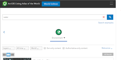 |
| Figure 1: Search Filters |
We are looking specifically for the
GLADAS Soil Moisture 2000 item. It will look like figure 2 below.
 |
| Figure 2: GLADAS Soil Moisture 2000 Thumbnail |
After clicking on the thumbnail, we can read about the project and see the metadata about the data set. Clicking on the "Open in Map Viewer" button in the top right corner of the overview we can see the entire map. Since we are focused on the Easter part of the Nile River, we go to the area and click on it. A popup window tells us about the soil moisture in the top two meters and beaks. It even shows us a bar graph representing water content by depth. We see that there is not much water and this makes seans since we are in the Sahara Desert region, as pointed out in the steps of
Get Started with ArcGIS Living Atlas of the World. (Berry, 2019) We can also see this in figure 3.
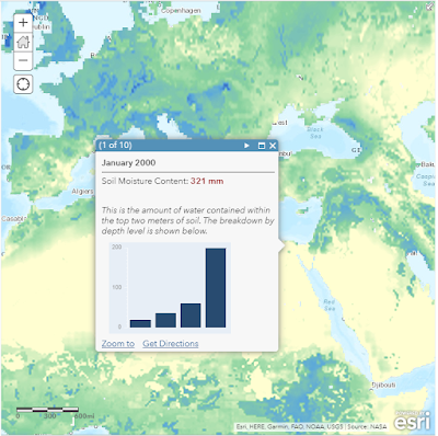 |
| Figure 3: Soil Moisture in the Easter part of Africa along the Nile River |
In within the living atlas are apps. We explore this by selecting apps in either the drop down menu or in the top ribbon. Within the apps section there are a lot of apps we can choose from that have running data sources. Some apps are UAS Wilde fire, Hurricane Aware, and, what we are interested in for this assignment,
Water Balance App. We will open the Water balance app. In the top you find a search bar. In the search bar ente
r 11°12'55"N 35°05'35"E. This is the area in Ethiopia we are interested in. Scrolling down we can see the soil moisture data from 2000 to 2020. In figure 4 we can see the visual representations of the data.
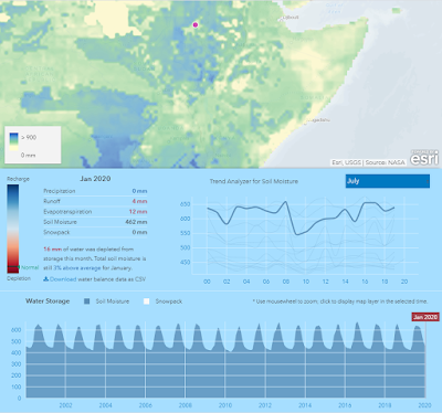 |
| Figure 4: Ethiopian Soil Moisture Values |
In the search bar of the app, we will search the Nile Delta. A similar map comes up show in figure 5. We can see that the rain fall does not help the soil moisture level during the rain season over the 20 years of data. Comparing these two maps, putting in the Grand Ethiopian Renaissance Dam could pose a problem as it might limit the amount of water that Egypt receives being down stream.
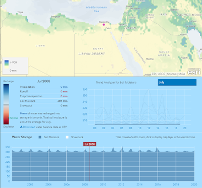 |
| Figure 5: Nile Delta Soil Moisture Values |
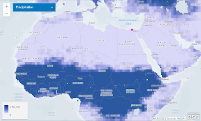 |
| Figure 6: Precipitation Levels Across Norther African July 2012 |
Figure 12 shows us the precipitation across Northern Africa in July of 2012. In this figure we see that Egypt receives far less rain compared to Ethiopia.
Moving from the app, we go to ArcGIS Online and exercise pulling data from the living atlas. We first center our selves over the 48 continuous United States. In the base maps tab we will choose the light grey base map. Clicking on the Add drop down menu, we will go to "Browse Living Atlas Layers." The living atlas thumbnails will be listed. In the ribbon just under the search bar titled "Search for layer' we will click the filter option and filter for environment. Turning on the "Only show content within map area" will allow us to view layers for our chosen continuous 48 states. These steps can be seen in figure 7.
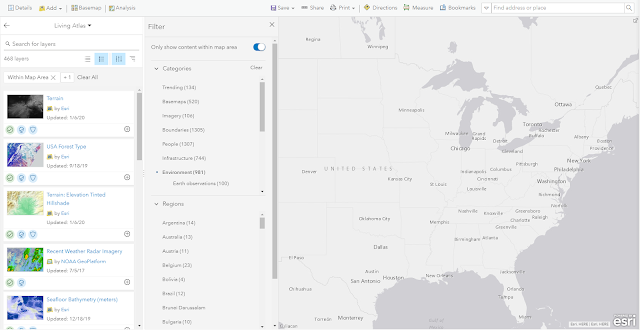 |
| Figure 7: Setting up out ArcGIS Online Map |
In the search bar we will search for "Land Cover" and add it to the map. On top of the Living Atlas pane, click the back button so we can focus on our map. In the top ribbon, you will find a location search bar. In that search bar type Las Vegas, NV. Close the popup window and bring the entirety of the Las Vegas area into the map. On the bottom you will see a time line. In that time line focus around the dates of December 31, 2005 through December 31, 2006. Clicking the previous and next buttons located in next to the time line, you can watch the increase in development of the area. This is seen in figure 8a and 8b.
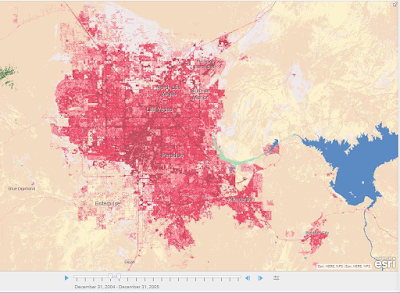 |
| Figure 8a: Las Vegas 2004-2005 |
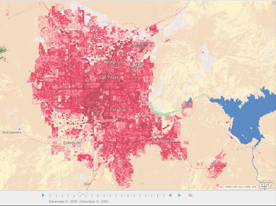 |
| Figure 8b: Las Vegas 2005-2006 |
Backing out to the continuous 48 states we can see the entire land cover of the US. Opening the content menu we can see the legend and what all the colors across the map mean. Figure 9 shows the whole US and the legend. We will go on and filter out everything to just look at the cities.
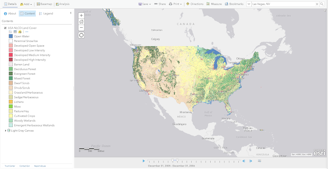 |
| Figure 9: The Entire 48 Consecutive States of the United States and Legend |
In the Details tab, we will open the contents section. Under the contents area, hover over the "USA NLCD Cover" so you can see the images under the title. Of those images click on the three dotes. Then go down and click the "Image Display." Under the Renderer area title, open the drop down area click the Developed Render. This will bring forward the cities. In the search location area, type in Maryland. In this picture we can see the District of Columbia, Baltimore, and Philadelphia areas. We will change the color ramp to Cyan to Purple color. With this we can more easily see the urban areas compared to the downtown areas seen in figure 10.
 |
| Figure 10: Washington D.C., Baltimore, Philadelphia Areas Dec. 2005-2006 |
We will then add a layer by going back to the add function in the ribbon. Click on the Browse Living Atlas Layers in the drop down menu. In the search bar of the Living Atlas, search for counties. Click on the "USA Counties" thumbnail and add it to the map. Back out of the Living Atlas and going to the Contents pane. Hovering over the UAS Counties layer we see our icons again. Click the icon with the yellow circle, red square, and blue triangle. This will take us to the change style page. In this page we will click options on the Location (Single symbol) button. In this tile we will click the syboles button and the fill function appears. Change the fill to no color and move on to the outline. Choose the bottom left color (#999999). This will change our boarders to a grey color. Click okay to apply the changes. This will take you back to the change style tile. While here change the transparency to 50% then click ok again and done, on the next tile. This will overlay all your changes onto the map. (Figure 11)
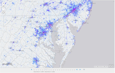 |
Figure 11: Washington D.C., Baltimore, Philadelphia Areas with County
overlay Dec.2005-2006 |
We will go to the ribbon on the top of the page to the Save function and open the drop down menu. Click save as and title the project "Urban Land in the United States," and add the tags "Living Atlas, Landcover, Counties, Urbanization." In the summary section we will type "This map shows urbanization patterns along the eastern coast of the United States." (Figure 12) Finally, we will click the save map button, saving it to our folder to be retrieved in the "My Content tab on ArcGIS applications.
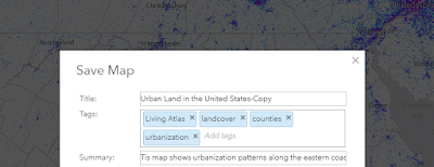 |
| Figure 12: Map Save Title, Tags, and Summary |
Now we move to the desk top application ArcGIS Pro. After downloading the
Hurricane Irma Advisory 29 we open a new map and add this to our map. On the left side of the page we will choose the Catalog tile and open the Portal. Then clicking on the cloud with a book on it we have access to the ArcGIS Living Atlas. In the search bar on the tile, we will search for "Nursing home." Choosing the first search result, right click and it to our map. With these two on our map we can see the track of hurricane Irma and the nursing homes that were in the path, figure 13.
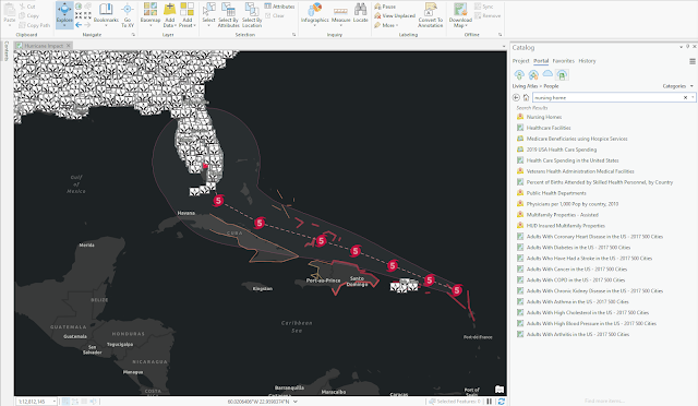 |
| Figure 13: Hurricane Irma Path |
On the left side of the page we open the contents page. Right clicking the NursingHomes layer then open the properties. You can check the metadata for the data set. (Figure 14)
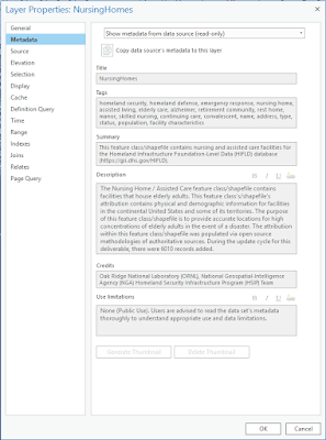 |
| Figure 14: NursingHomes Metadata |
To figure out how many nursing homes were affected numerically, we can use the summarize within tool. To get this We start by choosing the Analysis section in the ribbon. Opening Tools, will open Geoprocessing tile will open on the right. Before we click run on the bottom right of the tile We enter Forecast Cone into the Input Polygons, NursingHomes in Input Summary Features, and finally ForecastCone_SummarizeWithin into the Output Feature Class. After this is in we click the run and the hurricane path is activated. Clicking newly activated route gives a popup window. In this window on the bottom we see "Count of Points" next to that is the number of nursing homes affected. (Figure 15)
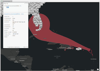 |
| Figure 15: Active Irma Route and Affected Nursing Home |
After this step, the G
et Started with ArcGIS Living Atlas of the World lesson is finished. I went further and added 5 new layers onto the same Irma map we crated. The first one I added was
Hurricane Evacuation Routes from the living atlas. (Figure 16) This overlays the roads into the map. I found this interesting because most of the nursing homes were directly located along these routes. I then added the
National Shelter System - Open Shelters onto the map to see the shelter locations and there locations along the evacuation routes. (Figure 17) Then I added the
Local Emergency Operations Centers (EOC) onto the map. (Figure 18) While searching through the atlas I found a layer for public schools called
Public Schools and put that into the map since public schools are routinely used as emergency shelters. (Figure 19) Lastly I added the major cities onto the map to see the major cities affected by the hurricane (Figure 20). With all of these on the map it looks extremely cluttered. (Figure 21)
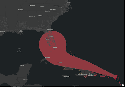 |
| Figure 16: Hurricane Evacuation Routes |
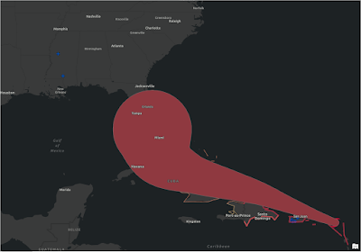 |
| Figure 17: National Shelter System - Open Shelters |
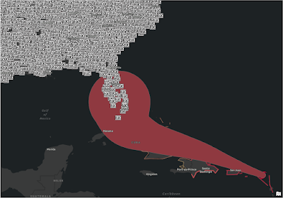 |
| Figure 18: Local Emergency Operations Center (EOC) |
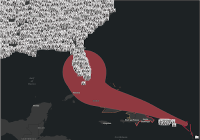 |
| Figure 19: Public Schools |
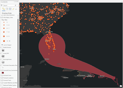 |
| Figure 20: Major Cities |
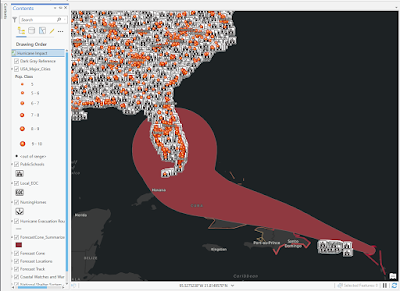 |
| Figure 21: Cluttered Map |
Conclusion
ArcGIS Living Atlas has a great wealth of information in that can be used to support and build any data set that one could put into the program. The ESRI lesson Get Started with ArcGIS Living Atlas of the World is a great way to learn how to find the data set. I say learn how to find the data set because there is just so much to explore. Knowing that this function exists and how massive its depth will provide priceless amounts of content.


Comments
Post a Comment